


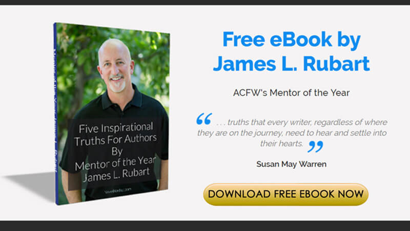

(Creston Mapes' Fear Has a Name is free today on Kindle.)
by Creston Mapes

by Creston Mapes
Since you’re here reading Novel Rocket, I’m assuming you love
novels. What about the covers of those books — do you love them as much as I
do?
I’m a cover junkie. To get
away from my writing, I’ll sometimes grab a cup of coffee and wander the aisles
of my favorite bookstore, just absorbing all the different covers, the new
styles and typefaces, and the different graphic treatments. I’ve even been
known to snap a photo or two of those I really like that align with my genre
(suspense).
Since I had a new thriller
release Feb. 1 (Poison Town, David C
Cook), I thought you might enjoy reading about the process of how the cover for
that book came about.
 |
| Amy Konyndky, Design Manager for Trade Books at David C. Cook |
Let me start by introducing
the design manager for Trade Books at David C Cook, Amy Konyndyk. I asked Amy
what makes an appealing, must-pick-up novel cover.
“It has to communicate the genre,” Amy said. “You
don’t want to mislead the reader having them think it’s suspense when it’s
romance. It seems obvious, but I’ve seen some badly represented books. I try
to find the feel or essence of the book by determining what is the most
important thing or scene that will set the reader up for the content? It’s
almost like a movie trailer in print form. I prefer simple covers that
communicate effortlessly. And of course, the skill of the execution has to be
there.”
Next I asked Amy what
goes into choosing the best cover at the publishing house?
“We look
at a lot of things,” she said. “The genre, the audience, and the overall
opinions of the review group. There are a lot of seasoned people in the room
and we discuss comparative titles, how the book will be positioned, and what
the buyers want to see. We often go multiple rounds on one cover.”
When she has time, Amy
reads the entire manuscript to help her envision the book cover she is about to
design. She did that with my book, Poison
Town. She also asked me what images I pictured for the cover. I gave her
some ideas, such as smokestacks, perhaps an ominous manufacturing plant on the
poor side of town. I even told her we might want to show the mechanics’ old garage
in the moonlight, possibly people being chased in a car, etc.
To give you a bit more
context — Poison Town delves into the
lives of people who are getting sick and dying on the poor side of Trenton
City, Ohio. Some claim that chemicals leaking from a manufacturing plant are
causing illnesses. When hero and protagonist Jack Crittendon (reporter)
realizes his mechanic friends are getting sick, he investigates. Soon Jack
becomes engulfed in a smokescreen of lies, setups, greed, and scandal. The
deeper he digs, the more toxic the corruption he uncovers. As Jack faces off
with the big-time players behind the scenes and tries to beat the clock before
more people die, he realizes he knows way too much — and that knowledge
threatens him, his family and those closest to him.
 |
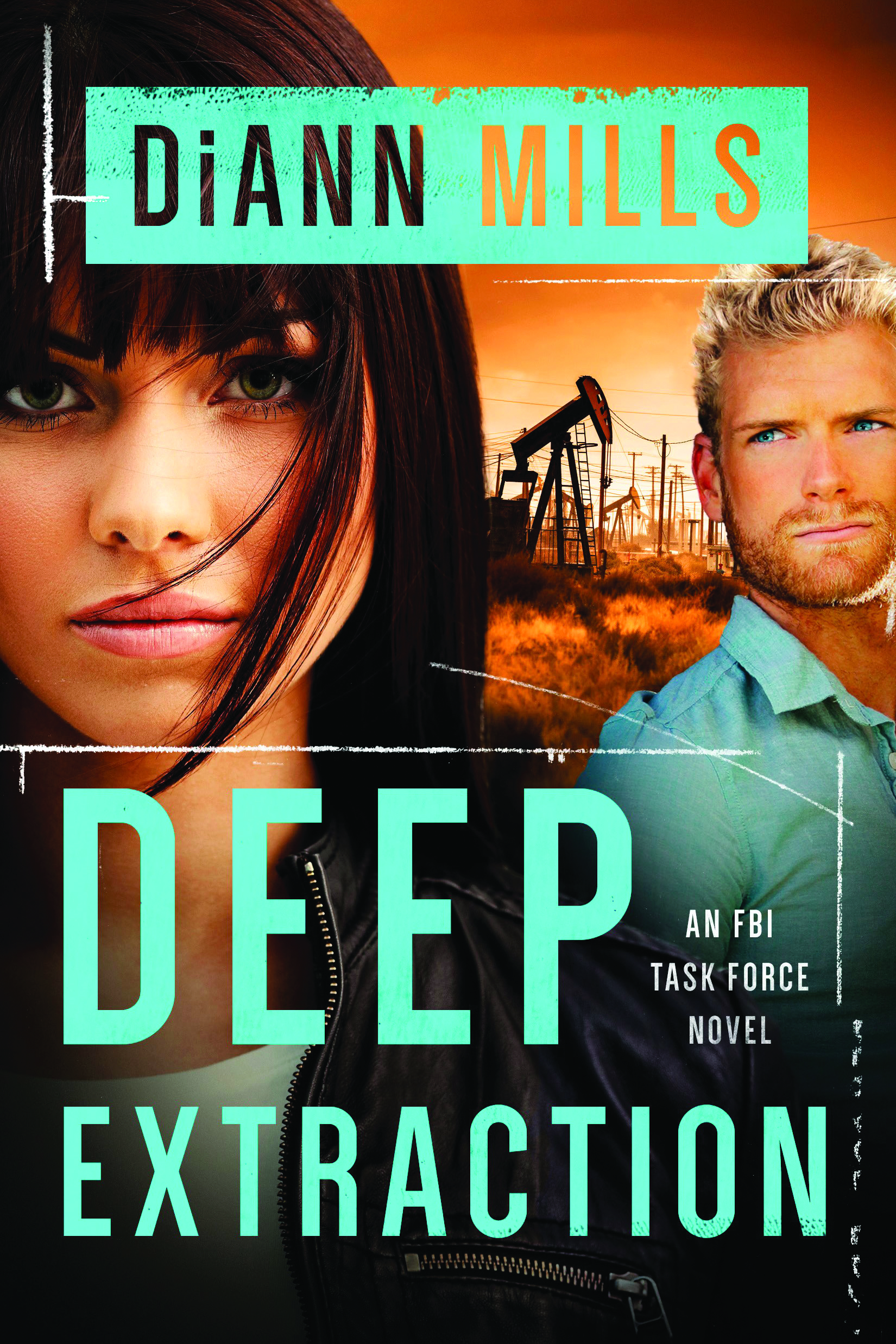
| Poison Town |
So, I asked Amy what
the team at David C Cook was trying to accomplish
when designing the cover for Poison
Town?
“Poison Town was a fun
one. The cover was boiled down to one main image, but the feel or essence of
the book’s content is spelled out,” Amy said. “The clouds are ominous, implying
impending danger, the smokestacks are pouring out dark smoke, and the title
treatment is a bright red, which hints at an intense page-turner. The
reader should know that this is a suspenseful read!”
I asked her if she could
share more about how the cover was shaped and perfected. “The cover was styled
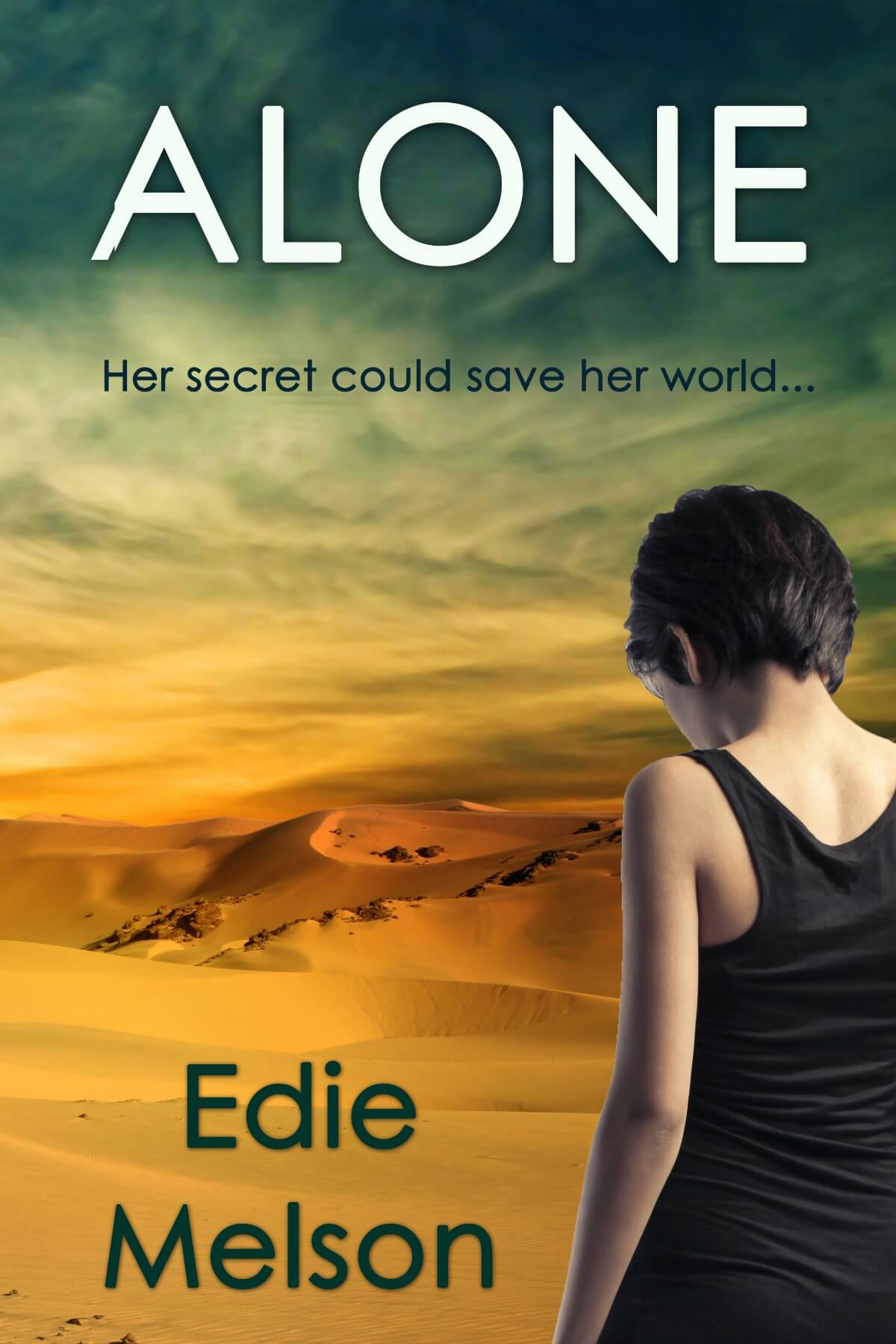
after the first book in the series, Fear
Has a Name,” Amy said.
 |
| Fear has a Name |
“I believe we set
the tone well for the series (The
Crittendon Files) with that book, then built off of it with Poison Town. I started
by reading the manuscript. Whenever possible, that is the best way for me
to work. I also spoke with you [Creston] about main characters,
scenes, settings, and so forth. That helped me get started. From
there, I pulled in some images and built as I went. I worked closely
with you [Creston] and your agent, Natasha Kern, to make sure all of the essential
elements were there. It’s very much a back and forth process.”
Early in the process, I
asked Amy if she and her team could make the three covers in The Crittendon Files slightly similar,
so readers would know the books were part of the same series. But I also asked
that they not be too similar, and I
did not want the covers to emphasize or highlight “book one,” “book two,” or
“book three.” My concern: I didn’t want readers to think they had to read book
one first to understand what was happening in books two and three. My desire is
for each book to read as an awesome stand-alone thriller, with or without the
other books in that series!
In my opinion, Amy and
the team at David C Cook nailed the Poison
Town cover perfectly (all three covers, for that matter). It is unique. It
implies a sinister story, thrills and danger, set in contemporary times. As a
fiction-lover, it is a book I would pick up in a heartbeat.
Most publishers give
the author his or her stab at 5-7 titles for the book, then their team decides
on the final title. With all three of my books in The Crittendon Files, the team at David C Cook approved my title
suggestions, which has never happened to me before!
I always invite author
friends and key influencers to read the manuscript early and provide
endorsements if they so choose. When we received the nice endorsement from
best-selling author Francine Rivers, we knew we wanted that on the cover,
because readers would recognize her name and, hopefully, pick up the book
because she enjoyed it. Then another strong endorsement came in from Third Day guitarist Mark Lee, and due
to the band’s name recognition, we wanted that on the back cover. Bam.
 |
| Sky Zone |
Personally, I love
endorsements and get a lot out of reading what other people have to say about a
book. If the novel has won awards, I appreciate knowing that, too. It
influences my decision about whether or not I want to read the book. Needless
to say, when we received an endorsement from best-selling author Jerry B.
Jenkins for my upcoming thriller, Sky
Zone (June 1, 2014, David C Cook), we cheered, gave Jerry a hearty thanks,
and got it right on the cover.
Do you have an opinion
about the three covers in my series, The
Crittendon Files? Or, perhaps you have a favorite novel cover you would
like to mention. Feel free to do so in the comments section, and thanks for
dropping in. I hope you’ll check out my thrillers. I promise you’ll find
tension on every page — and that they’ll live up to their cool and intriguing
covers.

Be sure to connect with Creston through his website and online!


Creston, I am also a cover junkie and I agree DCC got the cover of "Poison Town" just right. I'm reading it now and REALLY enjoying it. Also, the books work without having read the previous one, BUT the hints I'm getting in "Poison Town" about "Fear Has A Name" prompted me to pick up that first one too. And I'm betting "Sky Zone" will get into my e-queue pretty darn quickly.
ReplyDeleteBy the way, you didn't mention it Creston, but folks if you don't have "Fear Has A Name" today (Feb. 11) would be a really good day to visit your favorite e-retailer and pick it up. Just saying the timing would be really good for you, dear reader.
Thanks Michael. I am really enjoying the feedback this series is getting on amazon and goodreads. It's been a lot of fun. The team at DCC is top notch. Thanks for reading and commenting bro!
ReplyDeleteTotally agree on the critical cover factor. Covers matter big time. All three covers look good, Creston. Sky Zone is especially intriguing to me. I love what Amy had to say regarding nailing the essence of the book. The great covers do just that. (Two that came immediately to mind were The Passion of Mary Margaret and Comes A Horseman, two totally different novels.)
ReplyDeleteAnd two great books Nicole!
ReplyDeleteI love the cover art on all three (esp. the first!). I'd love to know thoughts on including a woman's face vs. a more scenery-style pic on suspense covers. I'm currently working on a mystery, and while I know cozies often have cute writing/artwork, it's tricky with a regular mystery, as it's slightly different from suspense. Regardless, I'm impressed w/the way all your covers draw readers in!
ReplyDelete(working on a mystery COVER, I should say)
DeleteHeather, because the covers of my first three novels weren't extremely appealing to women, who comprise 60-80% of all Christian fiction readers, we wanted to have a woman on the cover of Fear Has a Name. The testimonials from well known authors helped immensely. Thanks for you input and best with your mystery!
ReplyDeleteCreston, I read this article the other day and became so intrigued by your description of the story that I went to Amazon and downloaded it from Kindle, then decided I needed to read Book 1 first so I ordered the trade sized Fear Has a Name. I'm reading it now and I'm hooked. You gained a reader-fan with an article that had nothing to do with actually promoting your books, at least not in an in-your-face way LOL.
ReplyDeletePamela, great to hear that and thank you very much for sharing. Glad you dropped by!
ReplyDelete